Internship On Demand Project
Project Overview
Internship On Demand is a website platform that connects students in college to professional skills and job experiences to set them up for success for future internships.
My Role
I conducted research as part of a team that uncovered key areas of success and pain points for the primary users of this platform (referred to as “pre-interns”. From these findings, I created an interactive prototype to model areas of recommended improvement with annotations for stakeholders.
In This Case Study
OPPORTUNITY SPACE What improvements can be made to better streamline the user experience?
METHODOLOGY Cognitive Walkthrough, Context Inquiry
FINDINGS & RECOMMENDATIONS What works and what doesn’t? How can it be improved?
RESEARCHER’S INSIGHTS 3 steps to incrementally improve the user experience based off of key findings.
1 — Allow users to select preferred dates and times during onboarding
2 — Improve navigation by including embedded links
3 — Improve portfolio to enhance usability for primary users
SUMMARY
OPPORTUNITY SPACE
What improvements can be made to better streamline the user experience?
According to the Internship On Demand CEO:
“Internship On Demand’s pre-interns have the opportunity to apply to pre-internships and create a unique professional portfolio to share their work with hiring managers.Their portfolios can be made up of personal projects, school projects, and pre-internship work to help build a holistic understanding of a pre-interns whole self. Students/pre-interns have the opportunity to work through company-centric learning modules including readings, best practice documents, and video lessons.
During their program, students submit work-related assignments, collaborate as a team, and interact with company employees through discussions and panels.”
My job was to evaluate the usability of the platform, identify key areas for improvement, and visualize recommended changes.
With this in mind, my team and I determined our learnings goals and located key tasks primary users may try to regularly accomplish with follow up questions to determine to which degree the website allowed users to:
View video lessons
Download an assignment and additional resources from a lesson
Submit an assignment
Access external links like Google Meets
Post completed work to their portfolio
We conducted virtual context inquiries with 2 previous IOD students. I moderated one session, and the rest of the team took notes. We synthesized the data together briefly and then individually created prototyping plans.
Home Screen of Internship On Demand in current state
In-Module screen of Internship On Demand in current state
METHODOLOGY
Cognitive Walkthrough
To better understand what works and what doesn’t work with the Internship On Demand platform prior to conducting the Context Inquiry protocol with participants, we conducted a Cognitive Walkthrough.
During this first phase of research, we gained a better understanding of how well the website currently works and we discovered what currently exists.
By doing so, my team found a few areas that currently operate smoothly — like how to view video lessons and upload assignments — and a few areas that required many steps to complete a task, often resulting in the user misusing or or simply not using a feature at all — like updating their portfolio and sharing it with hiring managers.
Sample of Cognitive Walkthrough conducted prior to context inquiry with participants to allow researcher to better understand what works and what doesn’t work in current state.
METHODOLOGY
Context Inquiry
We wrote a Primary User Research Protocol, which prepared my team for 2 interviews with current or past IOD students. This method helped my team determine what we wanted to learn or know about the users and what our goals may be during the research sessions.
This protocol consisted of:
primary learnings goals — namely to better understand how well the website performs for pre-interns and how well the website prepares pre-interns for an internship, while uncovering the degree to which the user experience may be improved in usability and efficiency
a script including 6 tasks pre-interns may regularly do
follow up questions to better understand how they use the website and how well it works for them.
Using the context inquiry method, we utilized the script in our research protocol to keep our focus centered on our learnings goals but let the primary user walk us through their experience and shared with us their work environment so that we could better understand what kind of additional tools, websites, or resources they were using to accompany their course. We learned about the users context, how they used the website, and how well the website works for them using this method.
Our main findings from this method included:
Students were often expected to visit links or be on live Google Meets but had to copy/paste the link into a separate browser tab instead of being able to click on an embedded link. Additionally, they found the icons in the secondary navigation to be a little confusing as a brand new student.
The have required group meetings once a week for group projects but are randomly assigned to groups. The course is fully remote, which means pre-interns are able to fit Internship On Demand into their busy schedules, but these required group activities cause a bit of problems when their schedules didn’t match or pre-interns were in different time zones.
Not every student understood how their public profile/portfolio worked because of this inquiry method.
UX Researcher Ashley Madich moderates virtual context inquiry session.
UX Researcher Ashley Madich moderates virtual context inquiry session with previous Internship On Demand student.
UX Researcher visualizing notes during context inquiry session
Designer’s Insights
Visual Complexity
According to the Nielsen Norman Group, there are 3 strategies a designer can use to manage visual complexity in websites and applications. These 3 strategies prevent users from being overwhelmed by putting things in predictable places, using a clear visual hierarchy, and taking advantage of progressive disclosure. This video by the Nielsen Normal Group shows how this can be done and why it is important.
Because the stakeholder mentioned that the secondary navigation can feel “messy” at times and they would like a better way to organize it, I opted for a cleaner design with less brackets of information all on one screen. Primary users — the pre-interns — only work on one week at a time, so I hid non-current weeks in an accordion menu. It’s easy for users to navigate between the the weeks this way without feeling overwhelmed by the amount of information on one screen. I also included visual hierarchy elements like changing the button color states to a solid green once that section is completed, allowing pre-interns to easily navigate to incomplete sections without the need to view every element on the screen.
Interactive Prototype
Findings Based Recommendations
User Story 1
Allow users to select preferred dates and times during onboarding
“As a pre-intern, I want to be able to choose which days I am able to meet with my group before being assigned to a group so that I can connect and engage with group activities without compromising my schedule.”
User Story 2
Improve navigation by including embedded links
“As a pre-intern, I want to be able to easily navigate the website and recognize icons and links so that I don’t miss key elements of my pre-internship experience including but not limited to Google Meet links, key surveys, and mandatory assignments for graduation.”
User Story 3
Improve portfolio to enhance usability for primary users
“As a pre-intern, I want to be able to add relevant and important project related information to my portfolio so that I can use this tool to find potential employers.”
Allow users to select preferred dates and times during onboarding
1/3
Recommendation
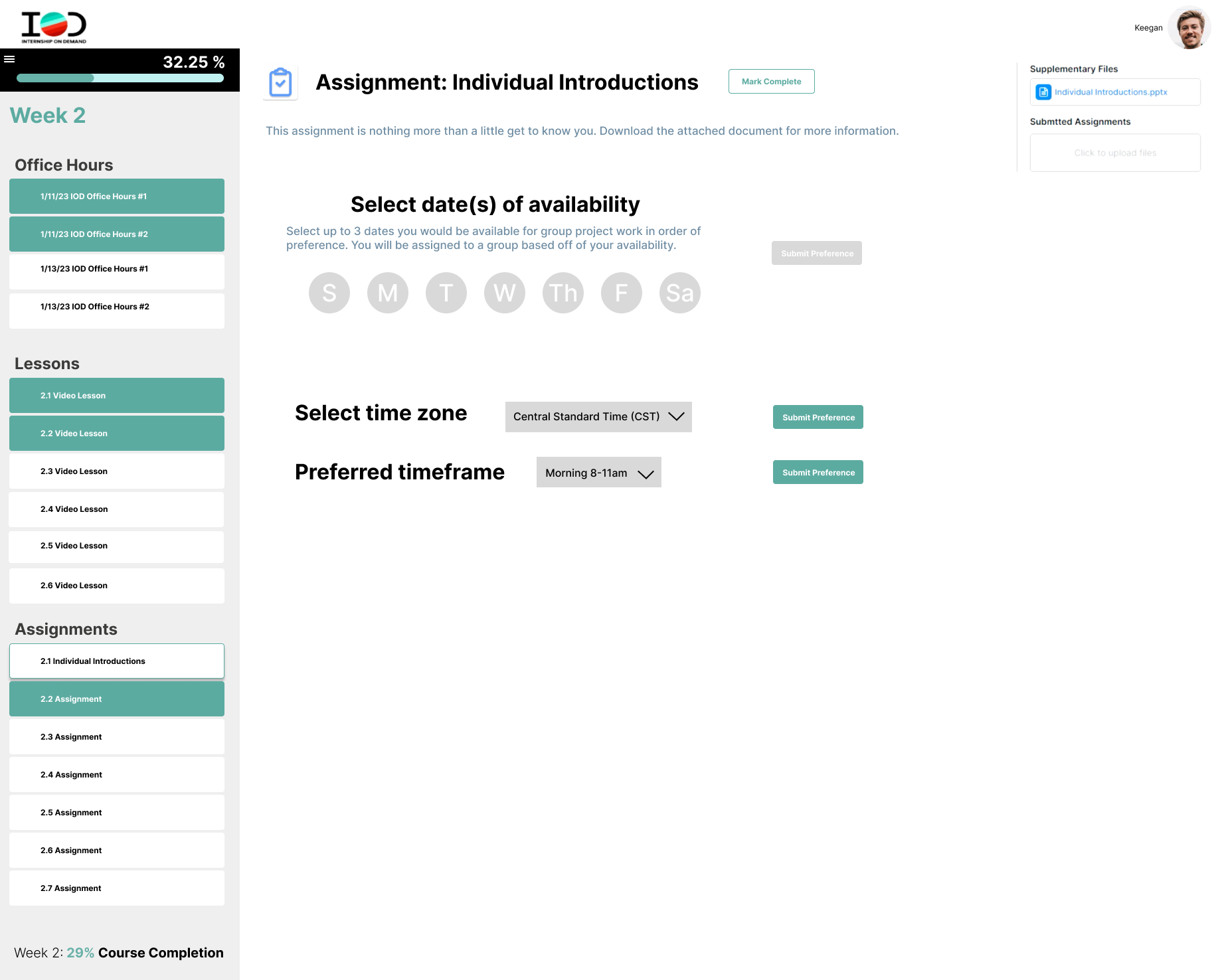
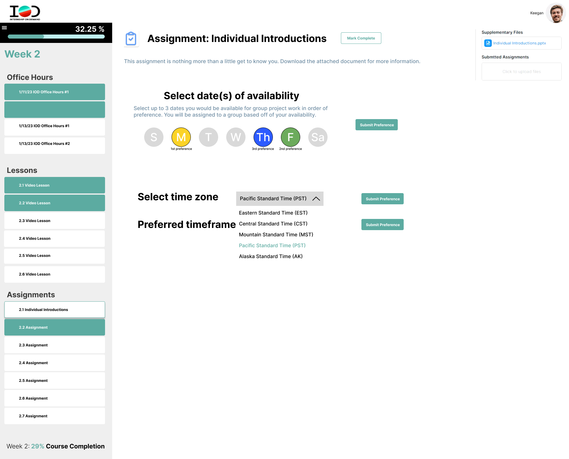
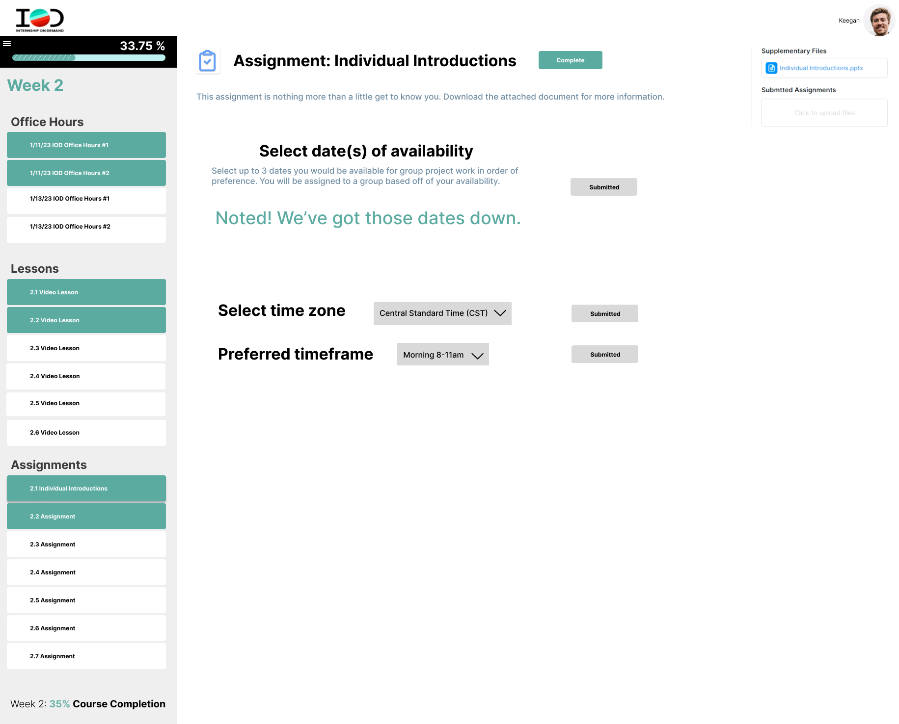
In addition to the assignment that already exists, I added two interactive sections that allow students to select their preferred date(s), time frame, and their time zone. This information would then be used by the the coordinator (faculty side) to create groups of pre-interns based on their preferences.
Insights
This considers the user story and goal by allowing pre-interns to fit their IOD experience into their schedules and have mandatory group activities based on their pre-determined preferences.
Improve navigation by including embedded links
2/3
Recommendation
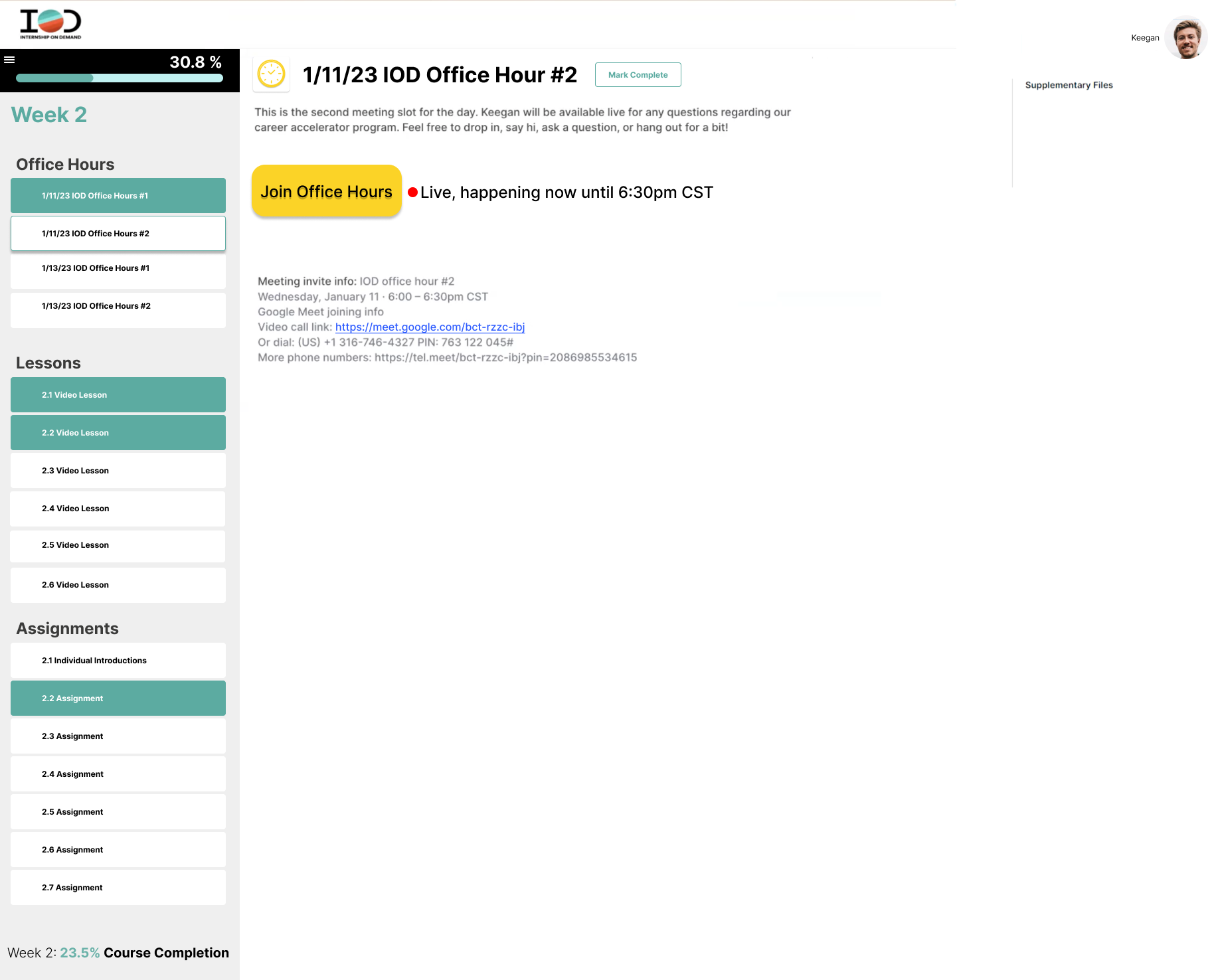
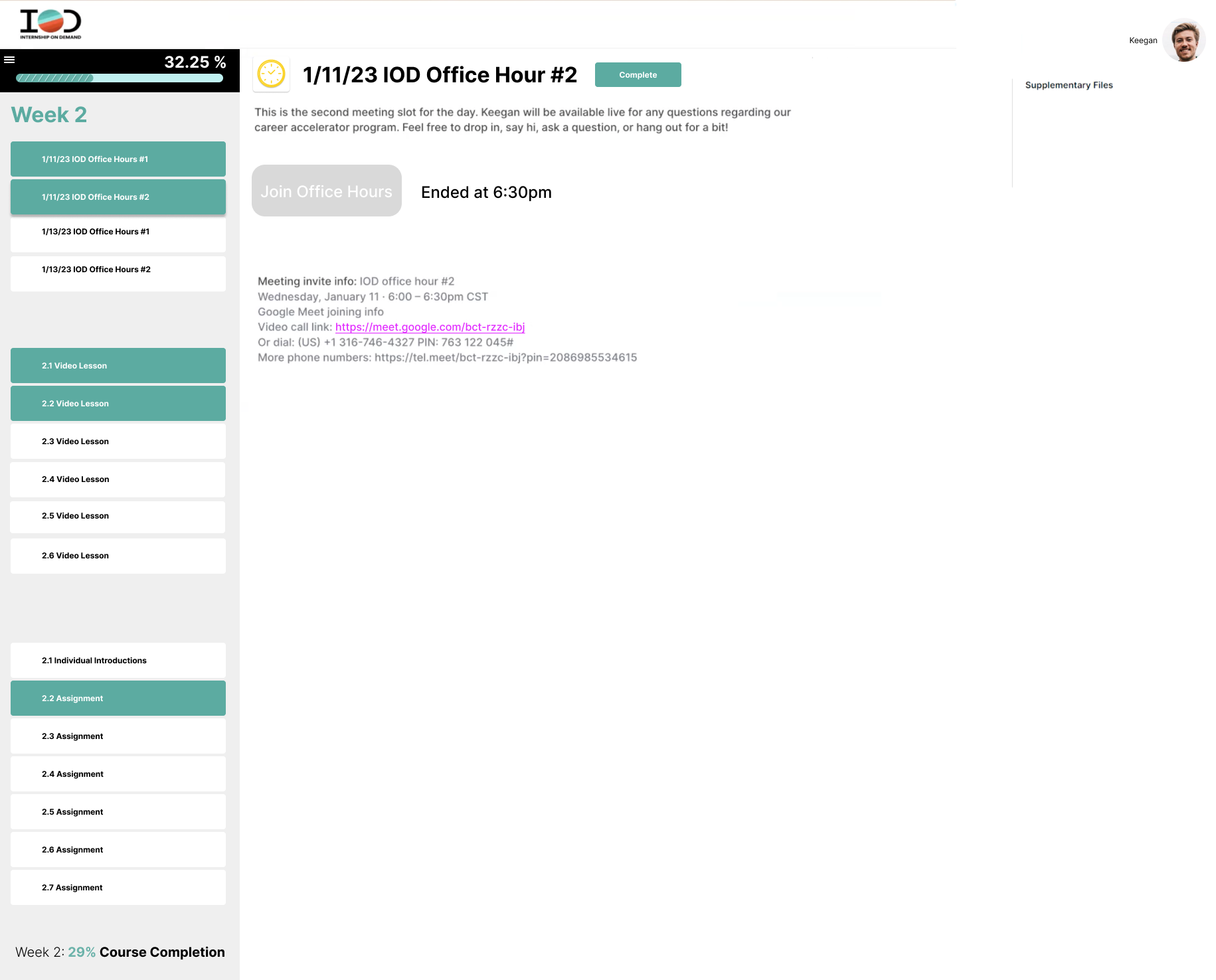
In addition to the Meeting Invite Info that already exists, I added an interactive button that visually indicates when a meeting is currently live with an embedded link so pre-interns can easily click to join the Office Hours meeting, and changes state to indicate when the meeting is either not yet begun or has already concluded.
Embed the link into the Meeting Invite Info, which before students and to copy/paste into a new browser so if the button doesn’t work for some reason students still have an easy 1-click way to access the meeting, and a visual indicator of when the link has or hasn’t yet been visited by making it blue when it has not been visited and purple/pink when it has been visited. This color pattern is consistent with other links status across the web.
Insights
This considers the user story and goals by allowing pre-interns to use their mental models of websites to easily locate links and important details without needing to view every single item on the screen to find relevant links.
Improve portfolio to enhance usability for primary users
3/3
Recommendation
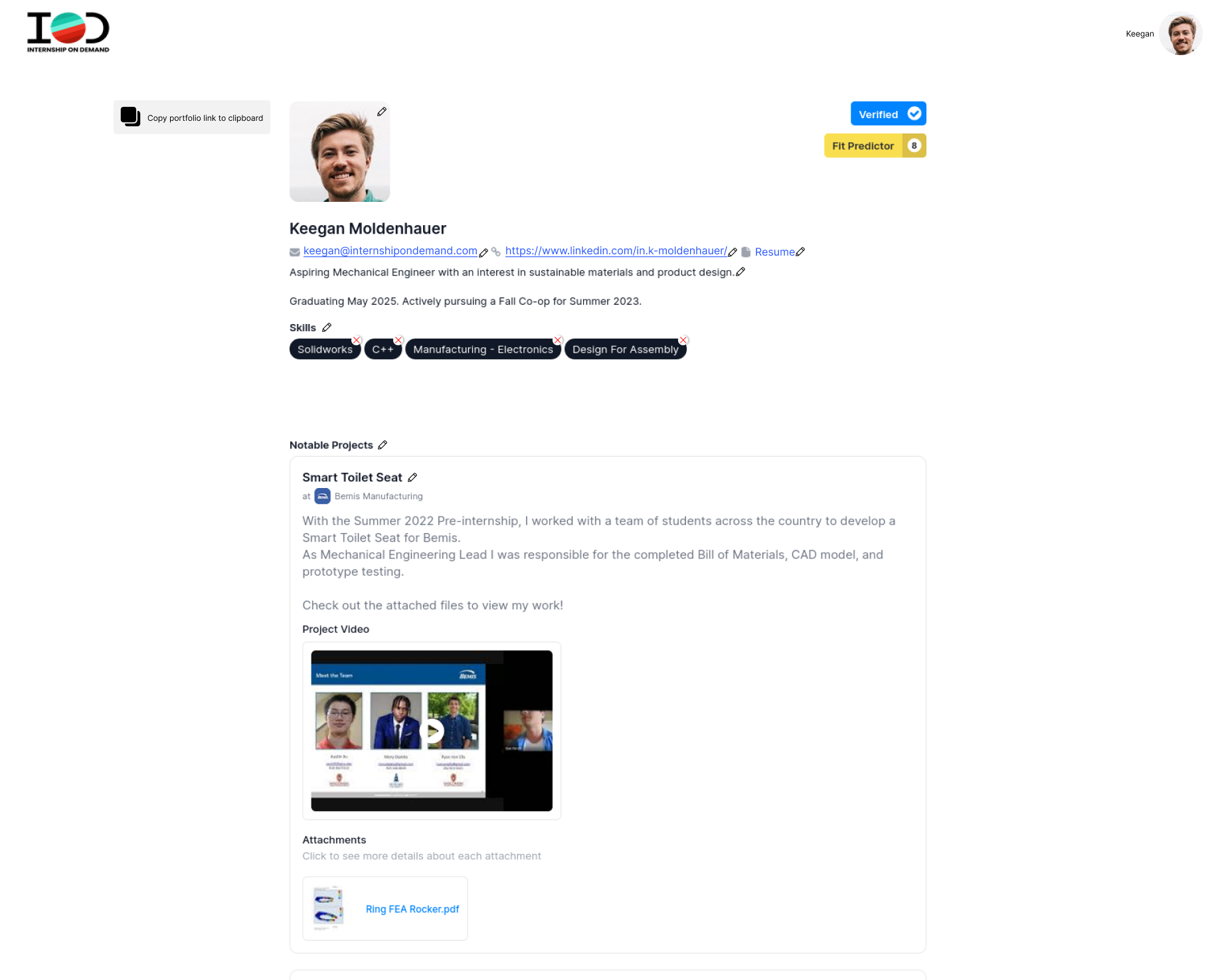
Make the site is live, with editable features when logged in as the account holder, much like social media platforms that currently exist.
The features of this portfolio are customizable but organized in a way that best display the types of information that is most important to the pre-interns.
Pre-interns can continue to display important links or PDFs like their email address, LinkedIn website, personal website, and their resumes, while also displaying their skills and projects.
This layout more closely resembles similar platforms like Facebook and Linked in, so hiring managers are familiar with the layout, but uniquely feature their projects in a carousel style.
Insights
This considers the users story and goals by allowing pre-interns to customize their portfolio easily without needing to navigate between viewing the live site and the editing section, which do not look identical, and easily identifies as a live site which allows pre-interns to use the feature as intended without additional learning curves.


